Our Work / Office Interior
Browse by:
Project Controls
Office Interior
- Client: Dog Digital
- Completion Date:
The new Dog Digital office is a playful mix of functionality and style. With a big visual trick at its core it aims to impress clients to show the capability of Dog Digital, and functions to give staff an interesting and highly functional working environment.
About the Project
Dog Digital were moving to new premises. Having occupied an 800sq ft office on a noisy street in the centre of Glasgow, their business had grown rapidly and needed bigger and more representative office space. They chose a 2,300sq ft site in a more prestigious part of the city centre. They rang me having seen another office I’d done and said, “we’ve got 40 grand to spend. What can you do”. We arranged to meet and talked over the issues involved and some initial ideas. It became clear quite quickly that we could work together.
We rapidly established a healthy level of trust and good communication. The initial premise of fusing ugly betty styling and dystopian art deco styling from Terry Gilliam’s brazil didn’t seem too complicated, grimey timeless plus colourful and slick, I can see that working well but for one thing. What exactly did they mean by the styling in brazil? Brazil paints a picture of a dystopian future where staff in the various departments of works function as slaves in a regimented fascist grey boxy machine and are encouraged to show no signs of love, compassion or humanity toward one another. Did Dog Digital want me to compartmentalise staff members and slot them into dead boxes where they were only able to communicate by email until they could escape for lunch? This was very important, if that’s how they relate to their staff then I’m not interested in working with them. Turns out, thankfully, their approach is nothing of the sort. They actively encourage open communicated between people in the office and maintain an equality of voice from cleaner to director.
The next stage was for me to really get to grips with the nature of their business, the dynamic of its internal workings, the expectations of their clients, the exacting spatial requirements of day to day function at their present level and in the future as the company is forecast to grow. I knew the aesthetics of the design needed to be driven by the ergonomics of use, and made it priority to establish a working layout, while keeping styling prominent in discussions.
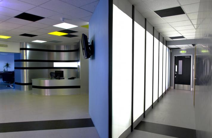
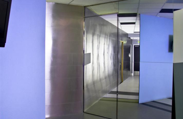
The core of the office functions around a big visual trick. When you first enter the office you are channelled down a very long, brightly lit corridor toward the receptionist. Except that it isn’t as long as it seems. Half way down the corridor sits a full height mirrored wall with a secret door to the meeting room. The mirror is angled to reflect the reception area, behind you to the right, but in exact alignment with the first part of the corridor. This becomes apparent after about 10 paces. The foyer area begins to appear on your right and opens out as a colourful and playful hub to the office where people appear and disappear from behind walls and around corners, normally going about their business. It was important that this area continued to be interesting to long term staff members using it every day as well as to newcomers.
The theoretical origin of this visual trick is the simple notion that as web designers, Dog Digital create new worlds that web users are immersed in. I wanted to reflect this in a physical way where you walk from the real world into an unfolding world of interesting possibility.
The materials used in this space are diverse and bold in their application. For example the entrance corridor is lined on one side, from floor to ceiling with oiled stainless steel, with a hidden big black room behind it. Facing that is a full wall of backlit white laminate glass, capped with aluminium and divided by thin black uprights.
The reception area finishes this illusory corridor with aluminium wrapped fully curved full height walls.
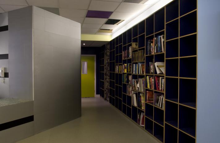
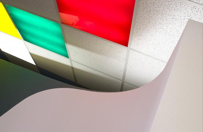
The foyer area has a floor graphic running up the walls into a painted mural. The lighting uses standard suspended ceiling fluorescent tube units as light boxes with coloured acrylic panels to give big squares of coloured light. It was really important to strike a good balance between a bright and exciting, playfull and graphically bold space and somewhere staff wouldn't feel overwhelmed or intimidated on a day to day basis.
The big open plan office I started with has become 7 rooms, including 1 room for storage and a server room.
The other rooms are:
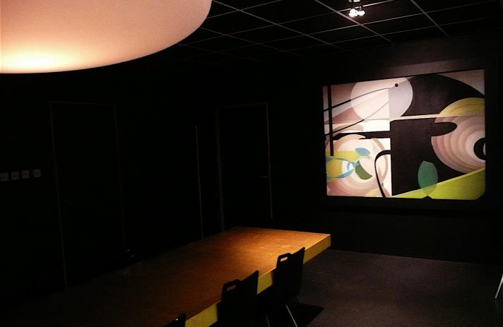
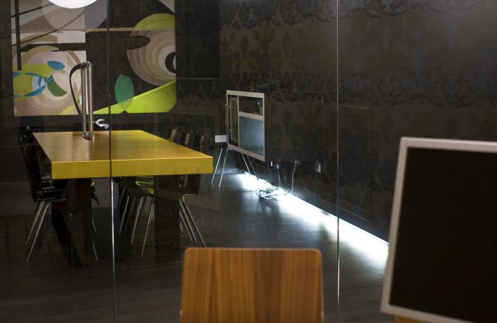
- The boardroom, a big, full blackout, black boardroom with 5.1 dolby surround equipped AV system for presentations. A large painting by local artist Heather lander sits on the end wall and has a deep frame housing a hidden projector screen, which pulls down for presentations, turning the painting into a moving image. In the centre of the room sits a 3m x 1m golden slab for a table. A 100mm thick birch ply construction, covered in 23.5 carat gold leaf and laquered satin. The boardroom meets the meeting room and is separated by a full height glass wall, with two way glass door and a fully retractable, full height, full length, double thick, 100% wool black curtain. When the curtain is open the boardroom and meeting room become one and the space feels huge. When closed, both rooms feel completely private and cosy. The 12mm glass and thick curtain provide excellent soundproofing between rooms.
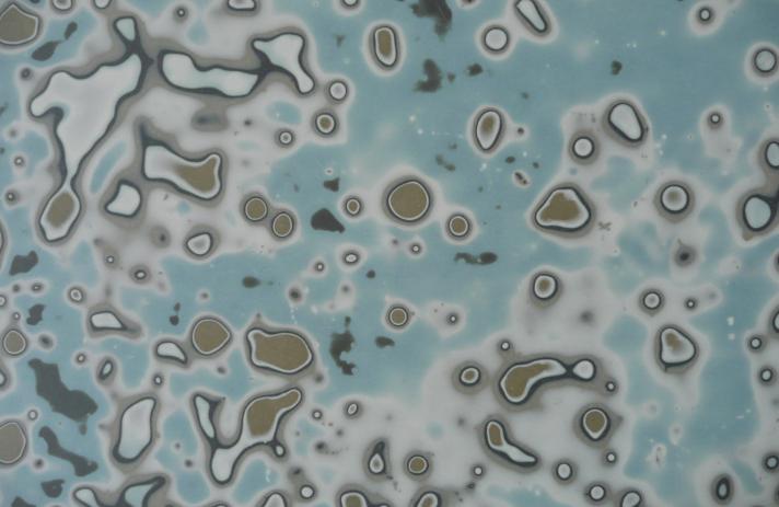
- The meeting room, by complete contrast is bright, colourful, highly patterned and vibrant, with hand printed, custom coloured Timorous Beasties wallpaper, blow moulded polypropylene pendant lighting from One Foot Taller and a beautiful, highly coloured, stripey floor in different timbers and rips of sheet material called CLUC. All this vibrant material plays off each other and acts as an exciting space for ideas development.
- The directors office is situated behind the big curved wall, containing the geometric mural. It has a ¾ height wall and large entrance to encourage an open approach between directors and other staff, while keeping enough privacy for focused work.
- The foyer has new materials and new products used to carry out necessary function and showcase local talent. The reception desk has a Jap Laq surface finish, a synthetic interpretation of an old Japanese laquer technique with a long lifespan, infinite colour range and engaging natural feel. This is a product i am developing and using in many applications.
The sofa in the foyer is by local furniture designer Colin McDougall, for Worhaus, as part of his ‘sloth’ range.
The exposed timber throughout e.g. door facias, is oak for a comfortable deco feel when sat next to stainless steel and aluminium.
The receptionist in the foyer is positioned at the centre of everything. In reflection or in real view they know where every member of staff is. They can see who’s gone into the meeting room and the boardroom. They know who’s gone to the toilet, they see into the directors office and into the main work room, so they can keep an idea on everyones whereabouts if anyone is looking for anyone else.
The general rule for the styling of the new office is that all the built elements and any costly components are laid out to be almost timeless in their appeal. The remainder, paint finishes and mural are there to be changed easily and at little cost as styles change. This way the look of the office can be updated at minimal cost and to keep in line with technological changes, showing the client that Dog Digital are at the forefront of their game and giving staff somewhere fresh and new.
Dog Digital are one of the best clients I have had the pleasure of working with, and I’m not just saying that. From the outset they were very trusting, very open, highly involved in the processes of decision making. They were very supportive and on-side at every turn. The result is an interesting space that I’m proud of and that they love.
Any time again, I’d be happy to.

